
Apr 24th 2026
How to Design Packaging That Tells Your Artisan Brand Story
Independent food producers and specialty brands thrive by leveraging authenticity as a competitive advantage, attracting loyal communities around distinctive products and values. Packaging becomes one of the most important tools for communicating that identity. Understanding how to design packaging that reflects craftsmanship and evokes emotional connection requires more than an attractive label.
Every packaging element should support the story behind the product, from the materials used to the words printed on the label. A well-designed package communicates quality, care, and originality before the customer even opens it. When executed effectively, packaging becomes a storytelling medium that helps small brands stand out on crowded shelves.
How to Design Packaging: Sharing Origin Stories and Craftsmanship
Artisan brands often begin with a personal journey. A family recipe, a local ingredient, or a traditional preparation method may serve as the foundation of the business. Custom packaging provides an ideal space to share that narrative with customers.
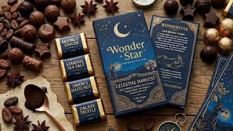
A short origin story printed on the back panel or inner label can introduce the people behind the product. Mentioning the region where ingredients are sourced or describing a handcrafted process can reinforce authenticity. These small details help consumers understand why the product is unique.
Visual elements can also support the narrative. Hand-drawn illustrations, vintage-style typography, or imagery connected to the place of origin can reinforce the message without overwhelming the design.
The goal is to communicate craftsmanship clearly and sincerely. Customers who feel connected to the story often become loyal supporters because the product represents more than a simple purchase.
Balancing Information With Visual Appeal
Packaging must communicate important details while still maintaining visual harmony. Nutritional information, ingredients, and regulatory requirements occupy space that designers must account for from the beginning.
Successful artisan packaging organizes information carefully so that required content remains accessible without cluttering the design. A clear hierarchy plays a major role in achieving this balance. Primary elements such as the brand name, product type, and flavor should be visible at a glance. Supporting information can appear on side panels or secondary surfaces where customers naturally look after picking up the product.
Giving information room to breathe, via whitespace, also contributes to readability. Allowing space between text blocks and graphics creates a more refined appearance and helps shoppers absorb information more easily.
Thoughtful layout decisions allow brands to communicate transparency while preserving the visual elegance expected from artisan goods.
How to Design Packaging: Using Texture and Finishes to Communicate Quality
Packaging materials and finishing techniques add a tactile dimension to brand storytelling. Texture often influences how customers perceive product quality before they even read the label.
Matte finishes create a soft, understated look that feels sophisticated and contemporary. Gloss coatings highlight color saturation and can add visual energy to certain design elements. Combining these effects strategically allows specific features such as logos or illustrations to stand out.
Demetallization techniques provide another distinctive option. When used on flexible packaging, this process selectively removes a thin layer from a metallized film, creating transparent windows while leaving other areas metallic. This technology combines the high-end, reflective appearance of metallic packaging with the ability to showcase the product inside through transparent windows. Seeing the interior contents can reinforce product freshness and authenticity.
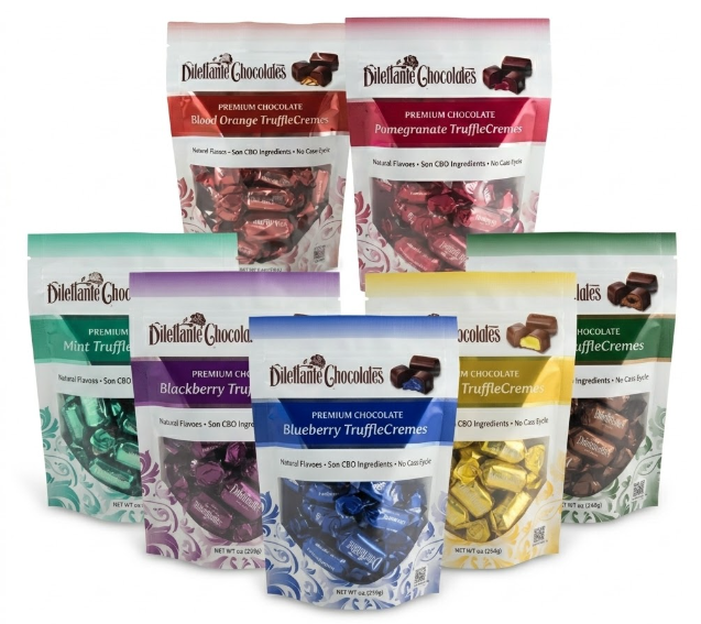
Material selection also contributes to the overall impression. Matte and gloss varnishes on labels or specialty films create a sense of craftsmanship that aligns with artisan positioning. Together with visual design, these tactile qualities shape the customer experience.
Creating Emotional Connections With Consumers
Artisanal products often succeed because they resonate on a personal level. Packaging plays a major role in building that emotional connection.
Color choices can communicate mood and personality. Earth tones may evoke natural ingredients and sustainability, while warm hues can convey comfort and tradition. There’s also distinct value in applying color consistently across packaging lines to help establish a recognizable brand identity.
Language on the package also influences perception. Friendly, conversational copy can make a brand feel approachable, while refined wording may convey heritage or sophistication. The tone should reflect the company’s values and the expectations of its audience.
Illustrations, photography, or small design details can also spark curiosity. A subtle graphic referencing the product’s origin or a visual motif tied to the brand’s history can encourage customers to explore the package more closely.
When shoppers feel an emotional connection, the product becomes more memorable. That connection often leads to repeat purchases and stronger brand loyalty.
Turning Your Brand Story Into a Tangible Experience
Transforming an artisan narrative into effective packaging requires collaboration between brand owners, designers, and packaging specialists. Every structural and visual element must support the message while maintaining functionality during storage and distribution.
Glerup Revere Packaging works with specialty food producers to provide packaging materials and design solutions that reflect craftsmanship and authenticity, and support distinctive brand presentation. Our product selection includes food-safe, flexible packaging, candy boxes, tins, films, pouches, accessories, and more. Reach out to the Glerup Revere team to discuss packaging options and designs that help your artisan brand story come to life.