
Oct 9th 2024
2025 Color Trends In Specialty Food Packaging
Color Trends in Packaging for 2025: Emotion, Excitement, Earthiness
The use and importance of color in food packaging goes well beyond simple design—it sets the tone for brand messaging, product appeal, and emotional connection. Emotion has been shown to drive consumer decision making. In fact, color is often the single most important factor in purchasing decisions.
For 2025, color trends in food packaging are becoming more personalized and emotionally driven, with strong connections to both warmth and sustainability. In the confectionery and specialty food industries, packaging plays a critical role in catching a consumer’s eye, which is especially important for boutique and high-end brands. By leveraging color trends to create package design that’s impactful on the shelf and meaningful to the brand image, you'll be well ahead of your competitors.
Note that design and color work together with the actual packaging material, so high quality packaging products are essential. That's what we stock at Glerup Revere Packaging.
Food Packaging Color Trends: Ambers and Chocolates
Ambers and Earthy Yellows in Package Design

Ambers and warm yellows in food packaging.
According to Observer and Trend Book, ambers, mustards, and earthy-rich yellows are projected to rise in popularity in 2025. These hues evoke a sense of warmth, comfort, and emotional relief. For consumers seeking comfort, rich yellows and ambers create an inviting presence on the shelf.
- Interesting packaging uses: Artisan chocolates, specialty nuts, premium snacks.
- Why it works: Ambers and golden yellows offer a mellow and nourishing feel. Yellow hues code as indulgent and luxurious when paired with metallic accents, and their association with warmth can create a visual link to the rich, comforting qualities of the product inside.
In addition, eco-friendly messaging can be supported by these tones, reflecting nature, beaches, autumn, sunsets.
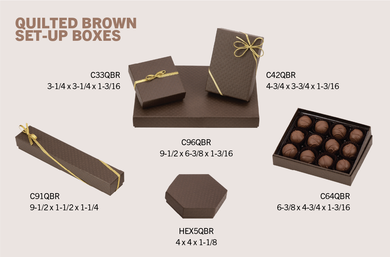
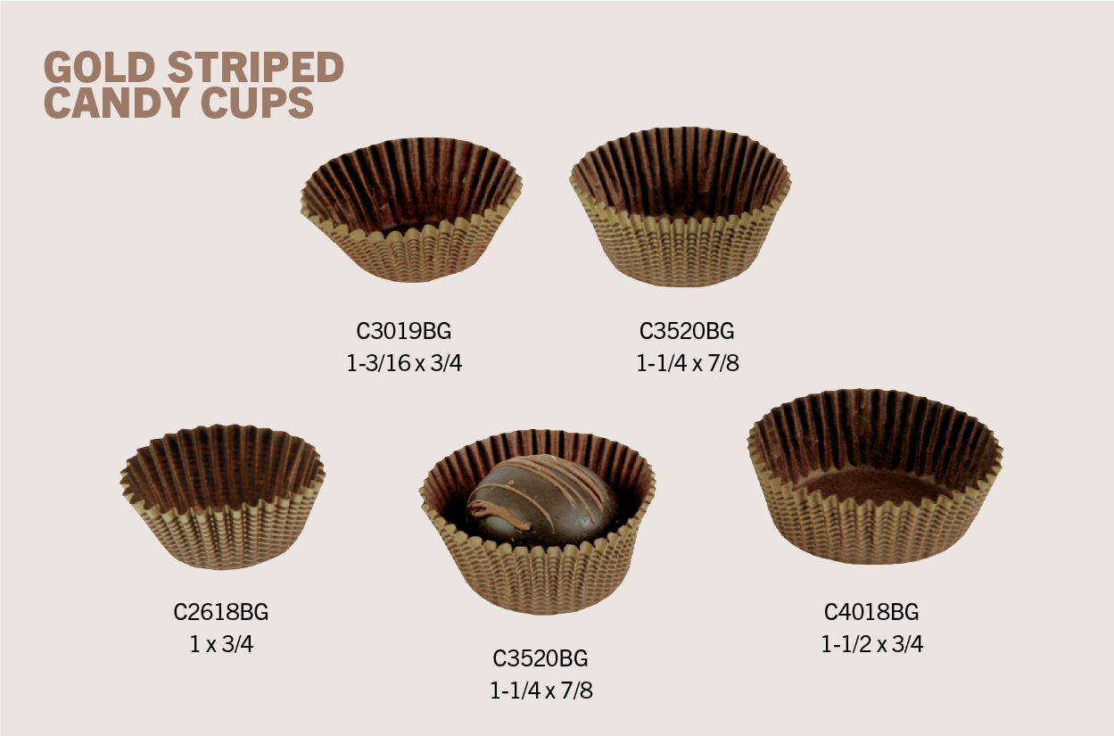
Delicious Browns in Food Packaging

Scrumptious shades of brown can animate packaging.
Browns have moved away from their 1970s roots and into dessert-inspired hues like caramel, toffee, and mocha. These colors are perfect for packaging products that are premium, handcrafted, or rich in flavor—such as gourmet chocolate and caramels. Ruth Mottershead, creative director at the British paint maker Little Greene, says they selected a light, tiramisu brown they call Mochi as their IT color for 2025. Pantone, meanwhile, selected "Mocha Mousse" as the 2025 Pantone Color of the Year. Both Mochi and Mocha Mousse are warm, nourishing, and delicious.
- Interesting packaging uses: Gourmet chocolates, caramels, baked confections.
- Why it works: Brown hues create a connection to natural ingredients and craftsmanship, appealing to consumers seeking authenticity, richness, and quality. These shades also pair beautifully with natural materials like kraft paper to reinforce sustainability, according to designer Carey Jolliffe and this color trends article from Sherwin-Williams.
The warmth and richness of dessert browns convey a sense of indulgence and sophistication, which is important for positioning high-end confectionery and specialty food items.
Give your Packaging "Color of the Year" Status
We offer all sorts of boxes, bags, pouches, containers, and candy cups that come in "dessert" shades of brown similar to Mocha Mousse. Call us and we'll help you find the shade you want - 866-747-6871.
Food Packaging Color Trends: Blues, Reds, and Greens
Cosmic Blues Add Excitement to Food Packaging

Ideas for excitable blues in packaging design.
While mid-tone blues have had their moment, deeper, more enchanting shades like Cobalt are expected to take over blues in 2025. These rich blues juxtapose both calm and excitement, making them ideal for specialty food packaging aimed at a more upscale market.
- Interesting packaging uses: High-end confections like truffles, specialty tea blends, limited-editions.
- Why it works: Deep blues create a premium, luxurious, authoritative feel and can make a product stand out on a shelf dominated by warmer tones. Blue also conveys trust and stability, which is important for specialty foods looking to build consumer loyalty (homesandgardens.com). By moving toward Cobalt, you add high energy to this reliable color.
Radiant Reds Cue Sultry Warmth in Package Design

Examples of shades of red for flexible packaging.
Reds, according to this Sherwin-Williams article will be turning up the heat in 2025. Rich, sultry tones like earthy reds, brick, and borscht-like hues can add depth and warmth to product packaging. As confectioners and specialty food brands well know, red is associated with sweetness, indulgence, and passion—and thus traditional for attracting attention to chocolates, candies, or seasonal treats.
Classic Valentine’s Day packaging such as heart tins are a perfect example of how red tones can be paired with shape to amplify emotion and drive impulse purchases.
- Interesting packaging uses: Valentine’s Day chocolates, berry-flavored candies, spicy snack foods.
- Why it works: Reds cue energy, excitement, strength, and passion, making it prime for impulse purchases. It also taps into emotions like love and desire, and so effective for limited-edition or holiday-themed packaging. Depending on the color, reds can be elegant, earthy, sexy, or playful, so know what you want to communicate and choose your shade with care.
Eco-Feeling Greens in Food Packaging

Great design and the right shade of green can tell a strong eco story.
Sustainability continues to influence consumer behavior, and nature-inspired greens definitely emphasize eco-friendliness. Emeralds and sages evoke a sense of freshness and purity, along with sophistication and luxury, depending on the exact hue. They can be ideal for brands focusing on organic or health-conscious products, but greens can also come off as the obvious or manipulative eco choice.
- Interesting packaging uses: Organic snacks, plant-based confections, new product lines.
- Why it works: Shades of green symbolize health and wellness as well as sustainability and environmental responsibility.
Color Trends in Food Packaging 2025: Bright Accents
Candy Accents in Food Packaging Design

Never underestimate a neon to jump off the shelf.
Bright, candy-colored accents will be a thing in 2025, giving brands a chance to inject fun and playfulness into packaging designs. Highlight colors like lavender and chartreuse bring a whimsical and energetic feel to packaging design, and can attract younger consumers or those looking for an escape. Try incorporating fun, fresh colors into sustainable packaging materials your brand’s eco-friendly perception while maintaining bold shelf presence.
- Interesting packaging uses: Gummy candies, novelty treats, playful and youth-focused snacks.
- Why it works: Using these electric hues in packaging can create an emotional connection that sparks joy, leans future forward, and, given the right context, awakens nostalgia. In retail environments, bold colors grab consumer attention.
Make Sure You Know What You Want to Say, Then Say It with Color
For the confectionery and specialty food industries, 2025’s color trends offer a rich opportunity to differentiate products using emotional storytelling. You just need to be clear what you’re trying to communicate. This article from Playbook describes the role of color psychology in design and includes notes on the non-verbal feelings evoked by various colors.
At Revere Flexpak, our Italian made BOBST MASTER inline HD flexo presses are state of the art and produce true, vivid color. Our long-time experience with these 10-color flexographic presses ensure that high-end designs lead to high-end packaging. We’ll help you hit the right hues.